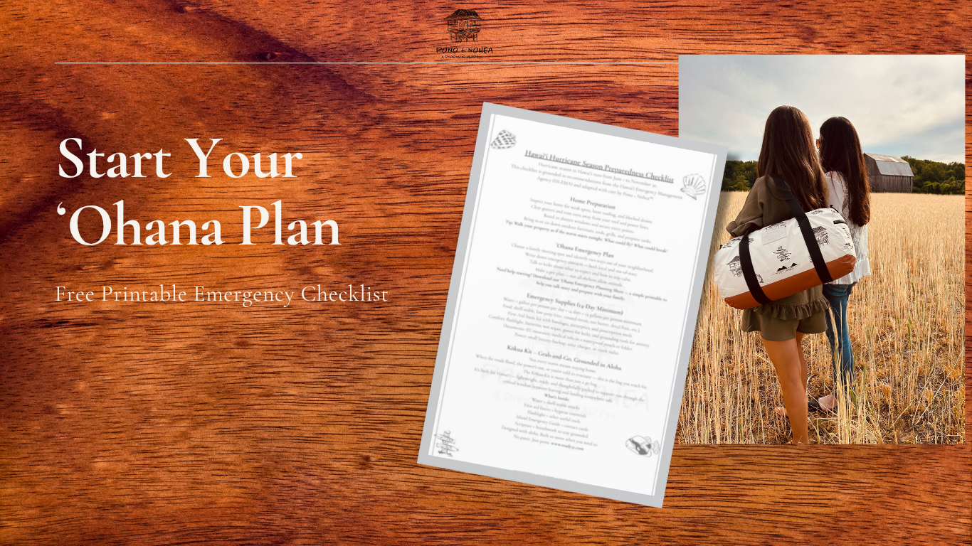
About Pono + Nohea
Built from cabin mornings, salt air, and island storms —
Pono + Nohea is preparedness rooted in peace, not panic.
Why I Built This
After years working in emergency management, I started thinking more about the quiet side of care—the small things that bring peace in everyday moments.
I wanted to create something intentional and personal. Something simple you’d actually use.
Something that made space for calm, comfort, and faith—without overcomplicating it.
Pono + Nohea started as a way to put that into practice.
It’s not about reacting—it’s about living with intention. Carrying what matters. And knowing that care can be both beautiful and practical.
Curated with aloha
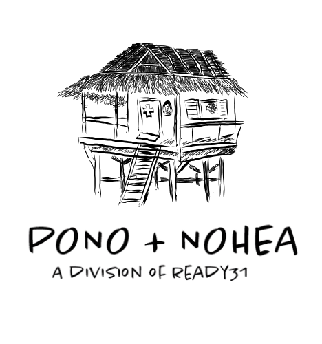
The Pono logo — a small rescue shack —
is our version of a safe place. A symbol of calm in a crisis. Simple shelter. Steady ground when the wind picks up. It represents readiness before the storm.
The Nohea logo outlines the two islands I grew up seeing across the bay —
the ones I greeted barefoot each morning as a child.
They are home. The part of this brand that’s rooted in stillness, salt air, and the kind of beauty that doesn't ask to be seen — it just is.
Together, they remind us:
Be steady. Be present. Be ready — and remember what you’re protecting.
We believe readiness can be beautiful.
That a kit can carry both soap and scripture.
That resilience and rest can live side by side.
Because aloha isn’t just a feeling.
It’s a way to weather life well.